‘Responsive Theme’ Videos
-
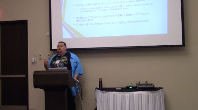
David Brattoli: Custom Responsive Theme Workshop
WordCamp Northeast Ohio 2016Speaker: David BrattoliJune 20, 2016 — After watching a video on WordCamp.tv, I discovered an easy way to create the basis for a complete custom responsive theme for WordPress. Demonstrating Steve Zehngut’s method for taking the Underscores Theme from Automattic and Foundation 5 from Zurb, we’ll build a custom responsive theme. Bring a Photoshop mockup, or just a sketch on a napkin and turn it into a reality during the session, or at least get a good start on it. Also included, you’ll see how to use this method to create a framework and then create a child theme for the look of the site, so you’ll be able to build future sites quickly.
-

Joe Casabona: Building Parsec – A Fully Responsive Theme
WordCamp Philly 2015Speaker: Joe CasabonaNovember 21, 2015 — This is a ‘sequel’ to the talk Joe gave at WordCamps last year; taking the principles he spoke about and putting them into practice, he will talk about how in Parsec he made images responsive, lightened load time, and introduced Sass. While earlier talks focused more on design decisions and planing, he will talk about coding this time around, so bring your developer hats!

An  Thingamajig
