‘Responsive Design’ Videos
-

Morten Rand-Hendriksen: Future Responsive Today – Embracing mobile-first with ‘picture’ and FlexBox
WordCamp Vancouver 2014Speaker: Morten Rand-HendriksenSeptember 17, 2014 — Responsive Web Design is about to get a whole lot more responsive with the element for responsive images and Flexbox for responsive layouts. In this talk front end developer and web standards expert Morten Rand-Hendriksen will provide the audience with everything they need to use these new tools today and show how a true mobile-first workflow will help them make cleaner, more efficient, and more responsive WordPress sites. You’ve heard about and Flexbox and now you’ll know how to implement them in your WordPress projects today! The future is now and it is responsive.
-

Christine Rondeau: Responsive web development made easy with CSS and the mobile plugin
WordCamp Vancouver 2014Speaker: Christine RondeauSeptember 12, 2014 — In this lightning talk, I’ll offer you some tips and tricks to get better looking sites on mobile devices. I’ll also show you how you can use the mobble plugin to get completely different layouts on mobile devices.
-

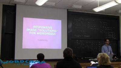
Joe McGill: Responsive Image Solutions for WordPress
WordCamp St. Louis 2014Speaker: Joe McGillAugust 24, 2014 — The hardest part about using responsive images in your web projects is—well—everything. The good news is that there are tested solutions that you can safely implement today while we wait for the browsers to sort things out. Learn what to consider when deciding on a solution for serving images to your users that are appropriate to their screen size and will walk away with several techniques to try out right away.
-

Russell Heimlich: Building pewresearch.org
WordCamp Philly 2014Speaker: Russell HeimlichAugust 21, 2014 — Speaker Russell Heimlich describes how he went about developing a new site design for the Pew Research site.
-

Cathrine Wind Fallesen: Responsivt design
WordCamp Denmark 2014Speaker: Cathrine Wind FallesenAugust 21, 2014 — Jeg er af den holdning, at man ikke længere kan frasige sig at lave et responsivt design, og min tilgang til det er nok mere konceptuelt og teoretisk, da jeg endnu ikke har meget erfaring med større implementeringer af denne holdning. Jeg kender dog til forskellige spændende frameworks, og giver et oplæg, der har et fundament i en mere grundlæggende responsiv forståelse, og understøttet med praktisk eksempler eller hjælpemidler, hovedsagligt med tanke på mindre projekter og nybegyndere. Jeg vil også debattere bedre tekniske løsninger i forhold til det responsive, hvis nogen ville have kommentarer til det.
-

Joe Casabona: Responsive Images and Other Fun Code for RWD in WordPress
WordCamp Philly 2014Speaker: Joe CasabonaAugust 21, 2014 — Joe Casabona covers some of the core content from his book, Responsive Design with WordPress, which teaches you how to leverage WordPress to get the most out of responsive design. He focuses on some code heavy stuff, including how WordPress handles images, RESS, and more.
-

Erik Fadiman: Responsive Agile WordPress Workflow
WordCamp Seattle 2014Speaker: Erik FadimanAugust 21, 2014 — While a traditional waterfall workflow might have a designer handing static comps over to a developer, this no longer works in the age of responsive design and frequently causes friction between both parties. This workshop will help designers learn how to “design in the browser”, create a responsive style prototype, allow better communication with developers, and explain responsive design to clients. Stop making static photoshop comps and learn a more contemporary, agile workflow today.
-

Michala Lipková and Alec Kinnear: Approaching Responsive Design
WordCamp Slovakia 2013Speakers: Michala Lipková, Alec KinnearAugust 21, 2014 — Blíži citlivý dizajn
-

Michael Tighe: Designing with Intent
WordCamp Calgary 2014Speaker: Michael TigheAugust 21, 2014 — Do you have goals for your website?
What about a plan for how different pages on your site help accomplish those goals?
Do your plans and design considerations change on different devices?
Join Mike Tighe for an exploration and discussion of how smart design, planning, and consideration for user experience can make a huge difference in your (hopefully Responsive) WordPress site.
Topics covered:
Lots of examples!
– Goals and conversions
– Responsive design
– Design, empathy, and making happy users
– Good markers for success
– Dos, don’ts, and pet peeves that make Mike want to swear -

Kirsten Schelper: Typographie im Responsive Webdesign
WordCamp Hamburg 2014Speaker: Kirsten SchelperJuly 28, 2014 — Typografie im Web ist ein komplexes Thema. Endgültig unübersichtlich wird’s im Zusammenhang mit Responsive Design.
