‘Responsive Design’ Videos
-

Tipografia fluida accessibile nell’editor a blocchi
WordCamp Torino 2023Speaker: Stefano MinoiaApril 27, 2023 — Dal 2022, con il rilascio di Gutenberg 13.8 e WordPress 6.1, l’editor a blocchi supporta la tipografia fluida. Parlando di responsive design, la tipografia fluida è un’alternativa alle tradizionali media query per ridimensionare il testo con la dimensione dello schermo: quando si usano le media query, la dimensione del carattere cambia in corrispondenza di specifici breakpoint; quando si usa la tipografia fluida, la dimensione del testo cresce invece uniformemente, rendendola adatta a tutti i dispositivi, indipendentemente dalle dimensioni dei loro schermi.
Anche se la tipografia fluida è una tecnica conosciuta da anni, la sua adozione non è ancora così diffusa anche a causa dei problemi di accessibilità che può causare. Per le persone con ipovisione, è essenziale poter ridimensionare il testo; la tipografia fluida però, se applicata senza precauzioni, può invece rendere difficile o addirittura impossibile aumentare le dimensioni del carattere a sufficienza da poter soddisfare il criterio di successo 1.4.4. delle Linee guida per l’accessibilità dei contenuti web (WCAG).
In realtà, questo medesimo criterio di successo (e un po’ di matematica) ci possono guidare nel capire se la scala tipografica che stiamo progettando è accessibile, prima ancora di costruire un sito e testarlo. Durante la presentazione, scopriremo cos’è la tipografia fluida e come funziona, come fare in modo che sia accessibile e come utilizzarla in modo accessibile nell’editor a blocchi. -

Borislav Arapchev: Какво е Mobile First Index и как да се адаптираме за него
WordCamp Bulgaria 2020Speaker: Borislav ArapchevOctober 26, 2020 — Mobile First Index означава цялостна промяна в начина, по който Гугъл оценява и класира уеб-сайтовете при търсене . Алгоритъмът на световната търсачка вече анализира сайтовете с приоритет към мобилни устройства, на база технически и контент изисквания, както и тяхната ползваемост на мобилно устройство и на тази база ги подрежда в SERP. Mobile First Index е наложен от силно увеличената употреба на мобилни телефони в световен мащаб. Тази лекция ще ви подготви за тази промяна и да ви даде най-добрите практики, за да имате успех в новите условия.
-

Sarah Bonner: Why does My Website Look Weird on My Phone? Current Trends in Responsive Website Design
WordCamp Asheville 2018Speaker: Sarah BonnerJanuary 9, 2019 — A discussion on the best practices for creating a well designed responsive theme on WordPress.
Takeaways:
Key elements that make a beautiful responsive design.
How to choose the best responsive theme for you.
Best practices for managing logos, photos, colors, patterns and font styles on WordPress. “ -

Miguel Gil Rosas: Responsive design – mobile first y desktop first
WordCamp Gran Canaria 2018Speaker: Miguel Gil RosasApril 22, 2018 — Descripción de Responsive Design, Breakpoints y Media Queries con diagramas y código. Ejemplos de soluciones de implementación con varios tipos de maquetación, con especial atención a los menús de navegación.
-

Michelle Schulp : Pixel Imperfect: A Practical Approach To Responsive Design
WordCamp Seattle 2017Speaker: Michelle SchulpNovember 28, 2017 — With seemingly endless new ways to browse the web, we know that responsive design is here to stay. But how do we adapt the traditional design process to flexible screen sizes, device-based restrictions, and multiple use-cases without feeling like we’re giving up all control to the great unknown? We’ll learn how to use our Problem Solving Superpowers to move away from creating endless mockups, and into crafting Design Systems. You’ll learn actionable methods to transform how you design for the web, and workable ways to present these designs to your team or your client.
-

Ana Cirujano: Tipografía responsive: maqueta textos para todos los dispositivos
WordCamp Santander 2017Speaker: Ana CirujanoNovember 22, 2017 — Aprenderemos cómo componer los textos de una web para que sean más legibles y cómo maquetar para que se adapten a todos los tamaños de pantalla, de una manera muy gráfica: a través de ejemplos de malas prácticas y cómo podríamos mejorarlos.
-

Michelle Schulp: Pixel Imperfect: A Practical Approach To Responsive Design
WordCamp D.C. 2017Speaker: Michelle SchulpNovember 15, 2017 — With seemingly endless new ways to browse the web, we know that responsive design is here to stay. But how do we adapt the traditional design process to flexible screen sizes, device-based restrictions, and multiple use-cases without feeling like we’re giving up all control to the great unknown? We’ll learn how to use our Problem Solving Superpowers to move away from creating endless mockups, and into crafting Design Systems. You’ll learn actionable methods to transform how you design for the web, and workable ways to present these designs to your team or your client.
-

Michelle Schulp : Pixel Imperfect – A Practical Approach To Responsive Design
WordCamp Orange County 2017Speaker: Michelle SchulpJune 16, 2017 — With seemingly endless new ways to browse the web, we know that responsive design is here to stay. But how do we adapt the traditional design process to flexible screen sizes, device-based restrictions, and multiple use-cases without feeling like we’re giving up all control to the great unknown? We’ll learn how to use our Problem Solving Superpowers to move away from creating endless mockups, and into crafting Design Systems. You’ll learn actionable methods to transform how you design for the web, and workable ways to present these designs to your team or your client.
-

JuanKa Díaz: La importancia del contenido en tu web
WordCamp Barcelona 2016Speaker: JuanKa DíazFebruary 24, 2017 — En esta charla veremos como WordPress nos permite gestionar el diferente contenido de nuestra web, de forma nativa e incluso haciendo uso de recursos de terceros pero siempre con una regla básica, que nuestro contenido sea interoperable y abstracto. Se recalcará la importancia de hacer que el contenido de tu web sea lo más abstracto posible para ver cómo podemos dotar a este de funcionalidades añadidas haciendo buen uso de layouts y técnicas de Responsive Web Design.
-
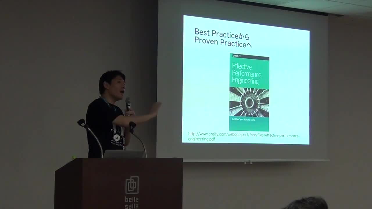
Yoichiro Takehora: レスポンシブデザイン前提のWordPressの表示速度高速化の考え方
WordCamp Tokyo 2016Speaker: Yoichiro TakehoraOctober 27, 2016 — 今や、Webサイトのアクセスの半分以上がスマートフォン経由となり、その画面表示に対応すべくレスポンシブデザインが広く普及してきており、WordPressがそのCMSとして使われるようになっています。
Webページの表示速度と可用性は、快適なユーザ体験を提供するために重要なWebサイトの品質です。欧米においては、表示開始時間0.5秒、表示完了時間が2秒以内と、過去に言われていた3秒ルールよりも速さが求められています。
この数値を達成するためには、WordPressだけの高速化だけを考えるのではなく、ネットワークやWebブラウザでの処理、サードパーティコンテンツを含めた全体最適化が必要になります。このセッションでは、WordPressで高速化するための考え方について解説します。

An  Brainchild
