‘Flexbox’ Videos
-
Mary Baum: Flexbox in 15 minutes!
WordCamp Boston 2018Speaker: Mary BaumJanuary 8, 2019 — Having trouble getting Flexbox straight in your mind? I can get you going with it in a matter of minutes. Come see how!
-
Joseph Abraham: WordPress and Flexbox CSS
WordCamp Los Angeles 2017Speaker: Joseph AbrahamJanuary 15, 2018
-

Marco Lago: Style Matters
WordPress Meetup TorinoSpeaker: Marco LagoApril 27, 2017 — Tendenze CSS, soluzioni moderne ed introduzione a FlexBox.
-

Joseph Abraham: Flexbox for WordPress
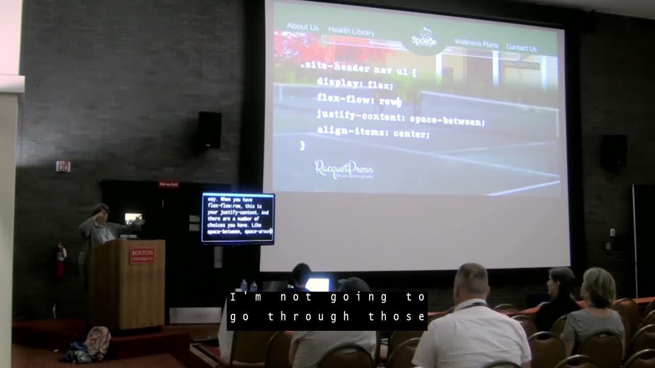
WordCamp San Diego 2017Speaker: Joseph AbrahamApril 15, 2017 — When making websites over the years, I often centered content vertically and created responsive columns. In order to achieve the aforementioned effect, I would use a css hacks. Every hack came with unique set of customized code for every major browser. Flexbox and grid were established (2009-12) to replace bloated use of ‘float’ and layout hacks. With Google partial to fast mobile friendly pages, flexbox serves content quickly and robustly, using less code. Current WordPress themes generally seem to be using non-flexbox methods to create a similar result; it’s likely this will change over the coming years. I am an advocate of flexbox. My presentation will answer the following questions. 1) Where did flexbox come from and where is it used now? 2) When should one use flexbox? 3) How does one use flexbox? 4) What is the future of flexbox? 5) Why is flexbox relevant for WordPress designers and developers?
-

Mary Baum: All Around the Block With FlexBlock
WordCamp St. Louis 2017Speaker: Mary BaumMarch 22, 2017 — There are 50 ways to leave your lover, 8 million stories in the naked city and now FIVE ways to lay out boxes in CSS:
– Floats and clears, the old standby;
– Display: block and inline, still highly useful;
– CSS grids (not ready for prime time)
– Display: table (why?)
– And my new favorite, Flexible boxes (flexbox).Let’s play!
-

Tim Blodgett: Flexing Your WordPress Themes
WordCamp Denver 2016Speaker: Tim BlodgettNovember 9, 2016 — In January 2016, Tim started using flex box in most of the custom themes he was creating. He’s been amazed at how simple it is to use and how helpful it can be and thinks you will be too.
-

Sallie Goetsch: Falling In Love With Flexbox
WordCamp Sacramento 2016Speaker: Sallie GoetschOctober 31, 2016 — For me, CSS Flexbox wasn’t just a discovery, it was an epiphany. It’s become my number-one tool for responsive layouts, and I keep discovering new uses for it.
If you’re a front-end developer or a designer who codes and you haven’t started using Flexbox yet, come to this talk to find out how to save time, save math, and save media queries. If you build plugins that add new content types (events, products, portfolio entries) and ship stylesheets and templates with them, Flexbox is the easiset way to create layouts to display that content attractively in any theme, on any size screen.
Join me for a tour of real-life design problems solved with Flexbox:
-

Beth Soderbergh: Introduction to Flexbox
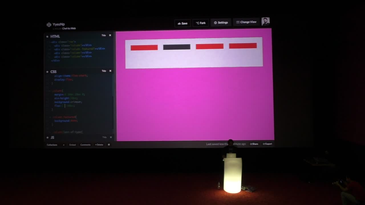
WordCamp Pittsburgh 2016Speaker: Beth SoderbergSeptember 30, 2016 — The flexible box layout model, also known as flexbox, is an alternative method of creating layouts using CSS. It has gained popularity amongst front end developers over the last year or so as browser support for it has increased dramatically. This talk will introduce the flexbox model, examine when to consider using flexbox in your projects, and will address browser compatibility issues you may encounter in implementing flexbox.
-

Luc Princen: Thinking outside the box(model) – An introduction to Flexbox
WordCamp Europe 2016Speaker: Luc PrincenJuly 1, 2016 — Flexbox is a new way to create responsive layouts. In this talk we’ll walk through some of the flexbox features and explore how you can start using flexbox right away to make your life as a theme developer much easier.
-
Luc Princen: Thinking Outside The Box (Model): WordPress Theming With Flexbox
WordCamp Sofia 2015Speaker: Luc PrincenDecember 7, 2015 — In this talk we’ll drop most of the regular box-model in CSS and start exploring flexbox. A new (and native) way to align, order and position elements in css. We’ll be live-coding a theme-page and getting a glimpse into the concrete advantages of using flex over the current techniques.

An  Contraption
