‘User Experience’ Videos
-
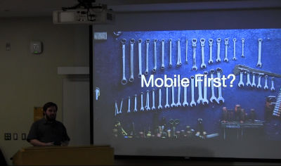
Sam Lalonde: Mobile Friendly WordPress
WordCamp Toronto 2017Speaker: Sam LalondeOctober 24, 2017 — The core principles of a great user experience are Content, Design & Functionality, and Speed. Some people say that we are living in the golden age of user experience but far too often we are technically trudging behind in providing rich and useful experiences and we especially lag behind when it comes to mobile-friendly websites. In fact, 53% of people will abandon a mobile site if it takes more than three seconds to load. Speed is a developer’s problem, a designer’s problem, and also a marketer’s problem. This presentation provides global and Canadian-specific facts and figures about how we are failing people visiting our websites and also covers the ways we can be improving our WordPress websites.
-

Claudel Rheault, Julien Biguealt: Développeurs et designers UX doivent être #BFF
WordCamp Montreal 2017Speakers: Claudel Rheault, Julien BiguealtSeptember 28, 2017 — La conférence présenterais les enjeux et la pertinence d’une collaboration entre UX designer et développeurs. En utilisant le case study d’un projet entièrement réalisé avec wordpress, nous présenterons les plugins utilisés, les challenges rencontrés et comment notre collaboration dès la première journée aura permis d’anticiper les problèmes tant du côté dev que du côté client.
-

Jesse Friedman: Improving User Experience and Engagement
WordCamp Portland ME 2017Speaker: Jesse FriedmanJune 6, 2017 — Jesse Friedman has been building websites for 18 years, and exclusively with WordPress since 2006. Since then he has written several books, taught hundreds of students as a professor, and organized dozens of local meetups (and even a few WordCamps along the way).
In his talk he explain how to build an MVP (minimal viable product). We’ll start by stripping out all the bloat, get rid of all those widgets and start with naked content. Then and only then we’ll start to methodically add features, as they are needed. You will be amazed how much your visitors enjoy just reading your content and engaging with you through simple solutions.You’ll walk away with practical strategies around:
– Building content driven websites
– Gaining traction and increasing engagement
– Elegantly monetizing your blog
– Plus 5 experience tips that will make your website 1 of a kind -

Monique Dubbelman: The Importance of Information Architecture – How to Organise Content to Improve User Experience
WordCamp London 2017Speaker: Monique DubbelmanJune 6, 2017 — The most important factor for people in web design is, that it makes it easy for them to find what they want. Yet, so many websites are so poorly structured, that it’s impossible to do so. If you want to learn what content should be on your site or how your menu should be structured: this talk is for you.
Information architecture is something serious, however, the majority of businesses have structured their sites in an bad way, using the ITTIR-method – “I think this is right”. While common sense is a useful tool and a lot of sites are very simple (e.g. 5 pages total), there’s a better way to go about it. If you already have tens of pages on your site, you should do proper information architecture analysis. Guiding people through the vast amount of information on offer is something that requires thought and research. Intuitive navigation doesn’t happen by chance. So don’t jump the visual part of of your webdesign too quick, but take plenty of time to think about the architecture of the information you offer on your site.
This helps you answer user’s four most important questions when they arrive at a website:
Am I in the right place?
Do they have what I am looking for?
Do they have anything better (if this isn’t what I want)?
What do I do now?
After this talk you’ve learned what content should be on your website and how you should structure it. -

Crispin Read: Object Oriented User Experience
WordCamp London 2017Speaker: Crispin ReadJune 6, 2017 — Crispin is a consultant specialising in UX and agile practice. Almost 20 years professional experience of user focussed development and open source frameworks.
Crispin Read on Object Oriented User Experience had some great ideas on how to take briefs/requirements and break them down in easy-to-understand ways.
Fitting user focused design methodologies into a development process needn’t be difficult. Our objectives as UX practitioners, as designers, as developers, as product owners etc are the same – to build the best possible thing in the time we have and within budget.
-

Karla Campos: The Current State of UX 2017: Trends, What Works, Future Predictions
WordCamp Miami 2017Speaker: Karla CamposMay 15, 2017 — In this session we will discuss the current state of UX and go over examples of UX done right. We will talk about what works, what the future holds, the process of creating websites people love to use, and ways to improve user experience.
It’s up to the design/development team to take lead and create amazing UX. In this workshop we will discuss taking that lead. The better the user experience, the more people will want to use and stay on your website. How many times have you loved using a website so much, you recommended it to a friend? Let’s build more of those websites and experiences.
-

Chris Ford: User Experience is More Than Hamburger Menus
WordCamp San Diego 2017Speaker: Chris FordApril 20, 2017 — Product companies are keenly aware of how important user experience is in the success of their theme or plugin. Designers and developers debate the merits of the hamburger icon, talk about content hierarchies, and strive to create an experience that surprises and delights their end users. We carefully craft, test, and iterate because usability is a make or break component of any digital product. One of the most difficult user experience hurdles to overcome is teaching people how to use them. An intuitive user interface, well defined hierarchy of information, and clear calls to action are a vital component of a positive user experience–but what happens when your product is more complex than you can describe in a five screen on-boarding animation? Bridge the usability gap with education. By educating your users, you’re creating a positive, empowering experience. Education empowers them to use your product without waiting for a response to a support ticket. There’s instant gratification. Who doesn’t love that? Whether it’s written documentation, video tutorials, or hands-on workshops and webinars, explaining complex concepts in a way anyone can understand can be the difference between a product people love and one they…don’t. In this presentation Chris will walk you through how your company can leverage education as a powerful force for improving the user experience of your product.
-

Chris Ford: User Experience is More Than Hamburger Menus
WordCamp San Diego 2017Speaker: Chris FordApril 18, 2017 — Product companies are keenly aware of how important user experience is in the success of their theme or plugin. Designers and developers debate the merits of the hamburger icon, talk about content hierarchies, and strive to create an experience that surprises and delights their end users. We carefully craft, test, and iterate because usability is a make or break component of any digital product. One of the most difficult user experience hurdles to overcome is teaching people how to use them. An intuitive user interface, well defined hierarchy of information, and clear calls to action are a vital component of a positive user experience–but what happens when your product is more complex than you can describe in a five screen on-boarding animation? Bridge the usability gap with education. By educating your users, you’re creating a positive, empowering experience. Education empowers them to use your product without waiting for a response to a support ticket. There’s instant gratification. Who doesn’t love that? Whether it’s written documentation, video tutorials, or hands-on workshops and webinars, explaining complex concepts in a way anyone can understand can be the difference between a product people love and one they…don’t. In this presentation Chris will walk you through how your company can leverage education as a powerful force for improving the user experience of your product.
-

Pascal Birchler: Decluttering WordPress
WordCamp Torino 2017Speaker: Pascal BirchlerApril 14, 2017 — As a developer working at a UX and WordPress agency, I’ve learnt a lot about common UI and UX mistakes. In this presentation, I will talk about how this knowledge helped us eliminate many pain points in WordPress itself and how this benefits the whole WordPress community thanks to open source.
From user registration to email notifications, I will highlight a few areas in WordPress that we thought were difficult to use, and how we solved these issues. This will include helpful advice for developers who want to learn more about UX and designers who want to start contributing to WordPress core.
-
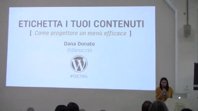
Dana Donato: Etichetta i tuoi contenuti – come progettare un menu efficace
WordCamp Torino 2017Speaker: Dana DonatoApril 13, 2017 — Come organizzare il menù di un sito sulla base dei suoi contenuti, dall’architettura delle informazioni alla scelta della tipologia di menù. Un’introduzione alle strategie di mapping – concettuali, tecniche e grafiche – che sono alla base di un sito che raggiunge i propri obiettivi.

An ![]() Production
Production
